7 Principles of Art
7 Principles of Art
The 7 principles of art are fundamental guidelines that artists use to create balanced and visually engaging works. They help organize the elements of art (such as line, shape, color, texture, form, space, and value) to achieve a successful composition.
The 7 principles of art are:
- Balance: This principle refers to the distribution of visual weight in a work of art. Balance can be symmetrical (both sides are the same), asymmetrical (both sides are different but still balanced), or radial (elements are arranged around a central point).
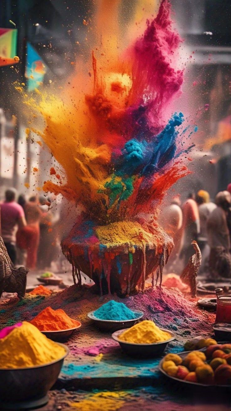
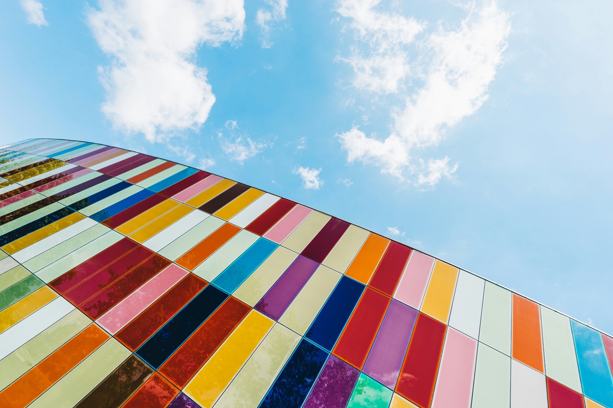
- Contrast: Contrast involves the use of opposing elements, such as light vs. dark colors, smooth vs. rough textures, and large vs. small shapes, to create visual interest and draw attention to particular areas of the artwork.
- Emphasis: Emphasis is about creating a focal point in the artwork, where the viewer’s eye is drawn first. Artists achieve this by making one area or element stand out more than others through the use of contrast, placement, size, and color.
- Movement: Movement refers to the path the viewer’s eye takes through a work of art. It can be directed along lines, edges, shapes, and colors within the artwork to guide the viewer’s gaze across the composition.
- Pattern: Pattern involves the repetition of elements such as shapes, lines, or colors in a systematic or regular arrangement. Pattern adds rhythm and can create a sense of unity within the artwork.
- Rhythm: Rhythm is the repetition of visual elements in a way that creates a sense of organized movement. It’s similar to pattern but usually involves variation to keep the composition dynamic and engaging.
- Unity: Unity (or harmony) refers to the cohesiveness of a work of art—how all the elements and principles work together to create a sense of completeness or wholeness. Successful use of unity makes a piece of art look like everything belongs together.
By applying these principles, artists can create well-composed and aesthetically pleasing works that effectively convey their intended message or emotion.
Now, let’s break down the 7 principles of art and include some personal examples to illustrate each point:
- Balance: Think about hanging a picture on the wall; if it’s crooked, it feels off, right? Balance in art is kind of like that. It’s making sure things feel stable and evenly distributed. When I was working on a landscape painting, I put a big tree on one side and balanced it with smaller trees and bushes on the other side. It felt like the scene had equilibrium, like nature intended.
- Contrast: Contrast is all about opposites. Imagine a bright, sunny day, with a single, dark storm cloud looming—your eye is naturally drawn to that contrast. In a portrait I did, I used a very light background to make the dark features of the subject’s face pop. It really helped to draw attention to the expressions and nuances in the face.
- Emphasis: When you’re telling a story, you might raise your voice or pause at important moments to grab attention. That’s what emphasis does in art. In a mixed media piece, I used a splash of vibrant red in the center to pull the viewer’s focus amidst a sea of muted tones. It worked like a visual exclamation point.
- Movement: Think of movement like guiding someone through a maze. In a series of photos I took at the beach, I used the lines of waves and the curve of the shore to lead the viewer’s eye from one part of the image to another. It felt like the waves were almost carrying you along.
- Pattern: Remember when you were a kid and drew a series of repeating shapes or colors? That’s pattern. I recently decorated a ceramic vase by repeating a floral motif around its surface. The repetition made the design feel consistent and cohesive, adding a rhythm to the artwork.
- Rhythm: Imagine the beat in a song, how it keeps things moving and engaging. Rhythm in art can do the same. In an abstract painting, I alternated thick and thin lines to create a visual tempo, making the piece feel lively and energetic. It’s like the art was dancing.
- Unity: Unity is like making sure all pieces of a puzzle fit together perfectly. In one of my collages, I used shades of blue throughout different images to tie everything together. Even though the photos were of different subjects, that consistent color made the whole piece look harmonious and complete.
Using these principles, artists create works that not only look good but also tell a story or evoke a feeling. When all these principles come together, it’s like magic—everything just clicks.